T hey seem to be everywhere, empty plastic water bottles fill our trash cans and litter the landscape. But Form Us With Love and IKEA have a solution. They’ve created Kungsbacka, a new line of kitchen fronts made entirely from recycled plastic bottles and reclaimed wood. Kungsbacka, with its chamfered edge, uses twenty-five bottles for every 40x80cm unit. There’s nothing cold about the design of this cabinet line. A soft edge creates a warm and sensuous feeling. And it’s beautiful.
“A plastic bottle is not waste, it is a resource. And most importantly, this kitchen proves that these materials can be used for household goods in large scale production,” stated Jonas Pettersson, CEO at Form Us With Love.
Using what others discard, the modular kitchen fronts are modern with a matte anthracite grey finish. It is a timeless aesthetic that will fit any contemporary kitchen for years to come. It’s also a great way to recycle the ubiquitous water bottle that clutters our lives and our environment.
I recently stumbled upon this article about a new book by Sean Adams on the AIGA DesignObserver blog. Adams is the Executive Director of the Graphic Design Graduate Program at ArtCenter and was a founding partner of AdamsMorioka. His use of color has always fascinated me. It’s daring, innovative, and always appropriate. Color has meaning and associations. And the use of color in all my assignments is based not on a favorite color, but a color palette that works.
U n like any other book I’ve ever read about color, this one is different. It’s not a technical manual on the light waves of primary, secondary, and tertiary colors. It is not a technical manual on the mixing of paint. There are a multitude of other books that do that. The Designer’s Dictionary of Color is a guide to the cultural, historical, and social meanings of a color. It is a welcome resource filled with examples of the application of colors and the range of options for an accompanying color palette. It’s what Sean Adams is an expert in doing. And as every designer knows, that’s no small feat.
Adam Wagner, Chief strategy officer and partner at Raindrop recently contributed an article that was posted on the Forbes Agency Council. His article resonates with me. Like Adam, I’ve always believed that there is more to marketing than just digital, and I’m sharing his article in this post.

A Antiquated. Outdated. Unnecessary. Ask an inbound-only marketer about print collateral, and these are the words you might hear in response. Meanwhile, marketers who see the big picture are using creative, conceptual leave-behinds to put a bow on their brand experience and make a tangible impression. With digital becoming the more prevalent marketing medium, there are moments when a high-touch piece of print collateral can make a surprisingly profound impact. Why?
People appreciate print collateral for the same reason they use handouts and take handwritten notes in meetings. Paper is ingrained in humanity, dating back to the earliest civilizations that used woven papyrus as a writing surface.
When creating brochures, mailers and other print marketing materials, graphic designers will often talk about creating collateral that “feels important.” Seeing a brochure on a screen doesn’t deliver the same tactile fulfillment as holding that very same brochure in your hand. We see millions of things on our screens each day and the digital overload dilutes the sense of importance in even the most memorable design.
Before we go any further, let’s make one thing clear: As we pump up the marketing value of printed materials, we’re referring only to those that are unique, thoughtful and creative. A static folder with a few sell sheets does not qualify as impactful collateral. If you’re going to invest in print, make it amazing. Think sizes, shapes, finishes and other fine details that will make your piece more valuable than the paper it is printed on. Consumer packaging can serve as a great source of inspiration.
Print collateral builds and strengthens relationships. It shows that you have gone out of your way to spend time and money on something that you plan to give away for free. We call it a “leave-behind” because it is meant to extend your presence. After your meeting with a prospect is over and you leave them to make a buying decision, a leave-behind subtly reinforces your brand by keeping you “top of mind” in the same vein as email or social media marketing — only your content is actually on their desk where they work every day instead of buried in their inbox or social feed.
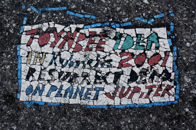
I am mesmerized by the anonymity, the process, and the typographic aspect of the messages left, or rather, adhered to some of our city’s streets. This is an interesting article that I discovered on Facebook. I can’t seem to get it out of my mind, and am intrigued by the idea of using the process (yes, good designers steal great ideas), to create impactful messages about social concerns. I can also see applications for social messaging (social media) and, or course, branding. The images left by the anonymous artist are reminiscent of both folk art and ancient mosaics.
To learn more, visit the the Atlas Obsccura website atlasobscura.com.